You want cultural divide? I'll show you cutural divide...
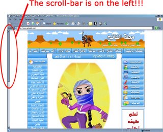
While browsing Wonkette, I learned of this. Now, I don't read Arabic, but sources lead me to believe it's basically a Hamas-related recruitment site targeted towards young children. Now, as horrifying as that is in and of itself, while browsing the site I found something more disturbing. What, you ask? Just look below...

What, you don't see it? Look a little closer... Still don't see it? Okay, I'll just point it out...

Yes!!! The scroll-bar is on the LEFT. I realize that based on the top-right to lower-left dynamic of Arabic script, much graphic design within the Arabic-speaking world actually runs opposite to what we're used to in the Latin, Greek, and Cyrillic alphabet-based portions of the world, mirroring our standard design formats based on the opposite-diagonal being the dominant one. I just have never before seen it as an influencing factor in web-design, and it just caught me off guard. I spent a minute just staring at the page, wondering how the hell I was to navigate it without the scroll-bar, before I finally realized it was on the left. It just comes across as, well, damn freaky. An affront to my sensibilities, more so than the cultivation of preadolescent martyrs.
Update: Al-Fatah.net appears to be down momentarily.


3 Comments:
yeah, catering to the young'uns is nothing new. Tobacco companies do it; why can't terrorists?
And I always thought the scroll bar was on that side because of a right-hand majority...
I hate it when designers screw with my scroll bar.
Hey- it's been like four days, I mean, you should have, like, 6 or 7 new posts on here... hello? are you there? (an imitation of you)
It'll be back...
Post a Comment
<< Home